Music Map
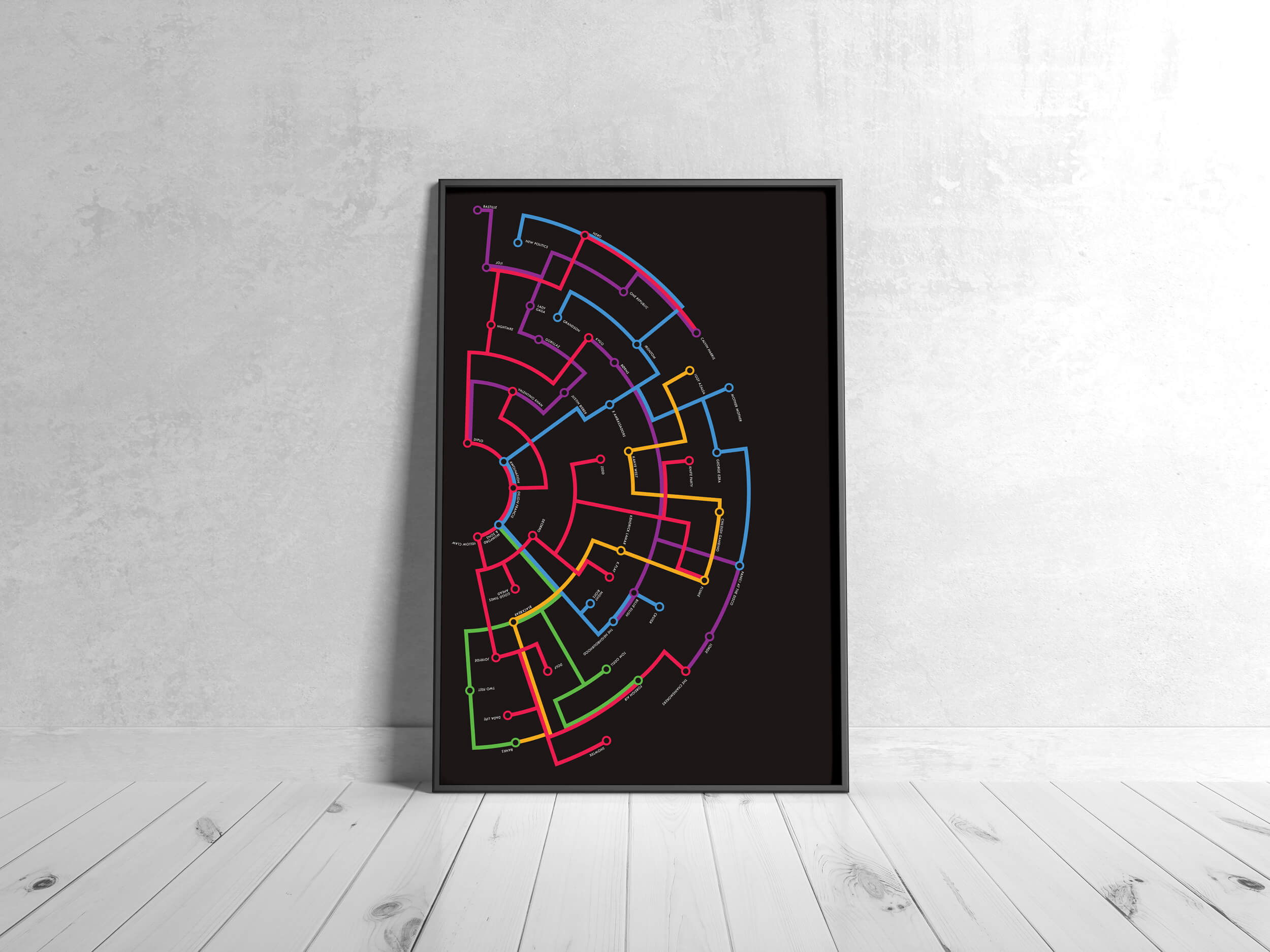
This underground subway map infographic showcases how various musical artists overlap in genre, while also explaining how often I listen to them. The closer to the center of the rings, the more frequently I listen to them. The further they are, the less frequently I listen to them.
* This piece was a semi-finalist in the 2018 Adobe Design Achievement Awards.
Elements
- Data Visualization
- Design


